Fusion Mineral Paint Cashmere: Color Review & Project Inspo
This post may contain affiliate links. For more information, you can read my full disclaimer here.
Are you considering Fusion Mineral Paint’s Cashmere for your next paint project? Look no further because this post is THE post to help you decide if Cashmere is the right color for you!
I know choosing a paint color isn’t always easy. And I also know it can be very helpful to see photos of a particular color in someone else’s home to get an idea of whether or not it’s the right color for you and your home!
That’s what this post is all about! This post is essentially a paint color review of Cashmere by Fusion Mineral Paint. In the post, I’ll share inspo photos from our farmhouse and photos of some of my past paint projects, all using the color Cashmere.
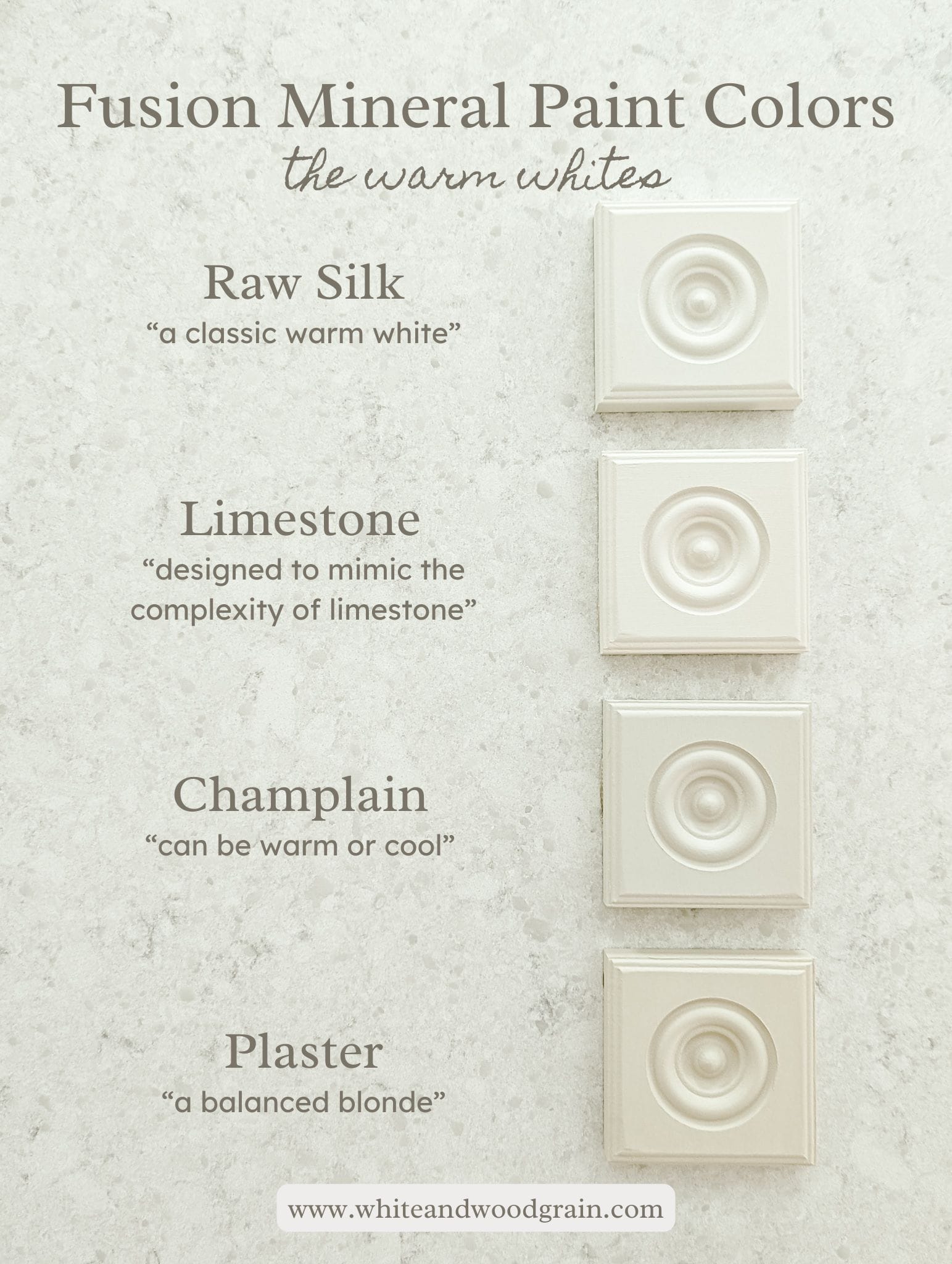
Today’s post will highlight the color Cashmere, but if you’d like to see more of my favorite Fusion colors, be sure to check out this post where I sampled 18 different white and neutral Fusion Mineral Paint Colors!
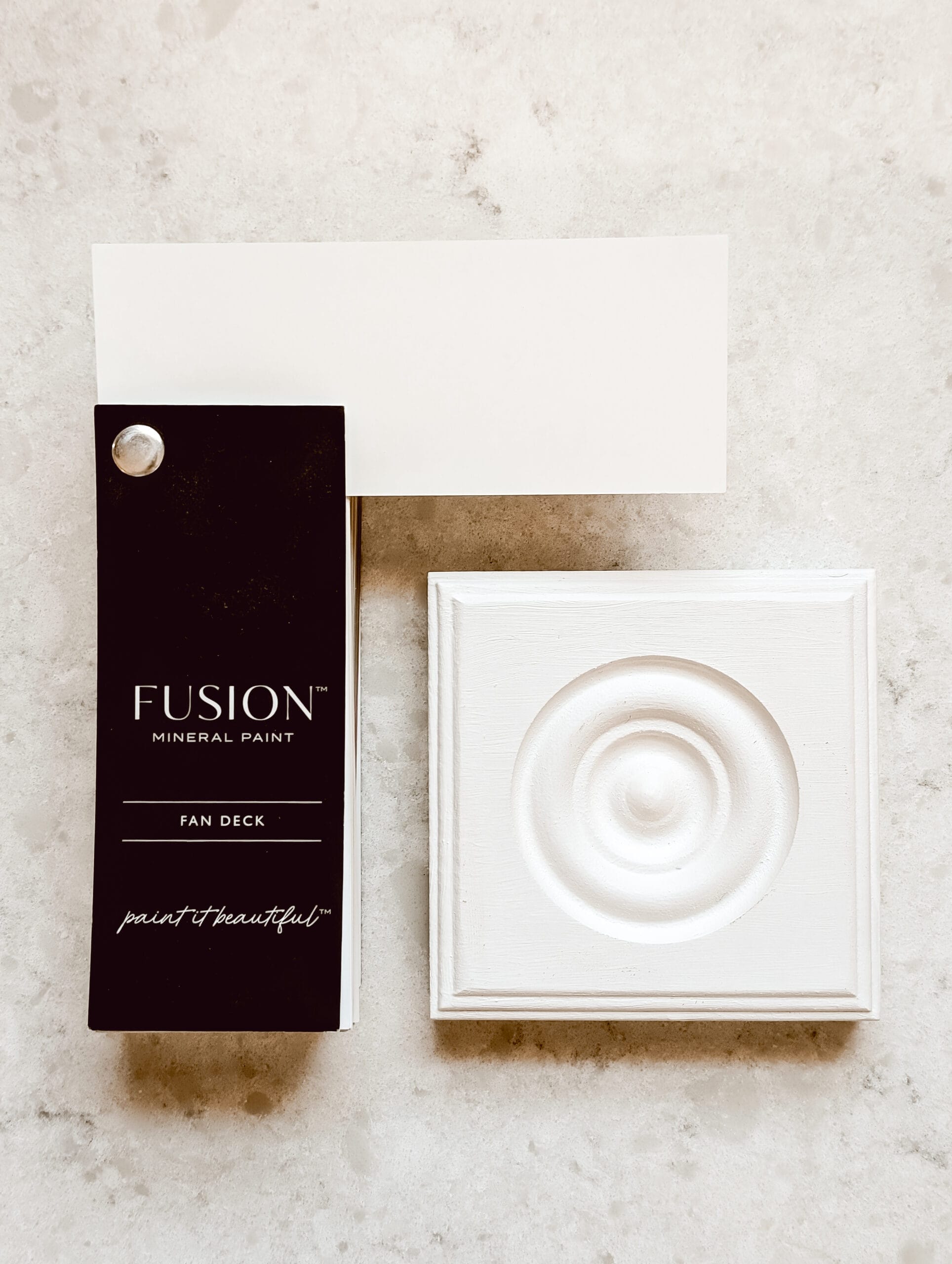
Cashmere by Fusion Mineral Paint: a neutral with a slight cream undertone
Let’s chat about the color Cashmere! It’s a beautiful neutral, with just a hint of cream. Not like a yellowy cream. But still a cream.
Cashmere is a slightly cooler toned neutral. It can read light tan to white depending on what you pair it with. I’ll show you a few examples and projects later in the post that will demonstrate how versatile of a neutral it can be!
Tap to Shop Cashmere
According to Fusion Mineral Paint, Cashmere is a luxurious neutral with a slight cream undertone.
Tap to Shop Cashmere
If you’re looking for a good neutral color, one that can read off white / tan / white depending on the lighting and the other colors in your space – Cashmere could be a great color for you to try!
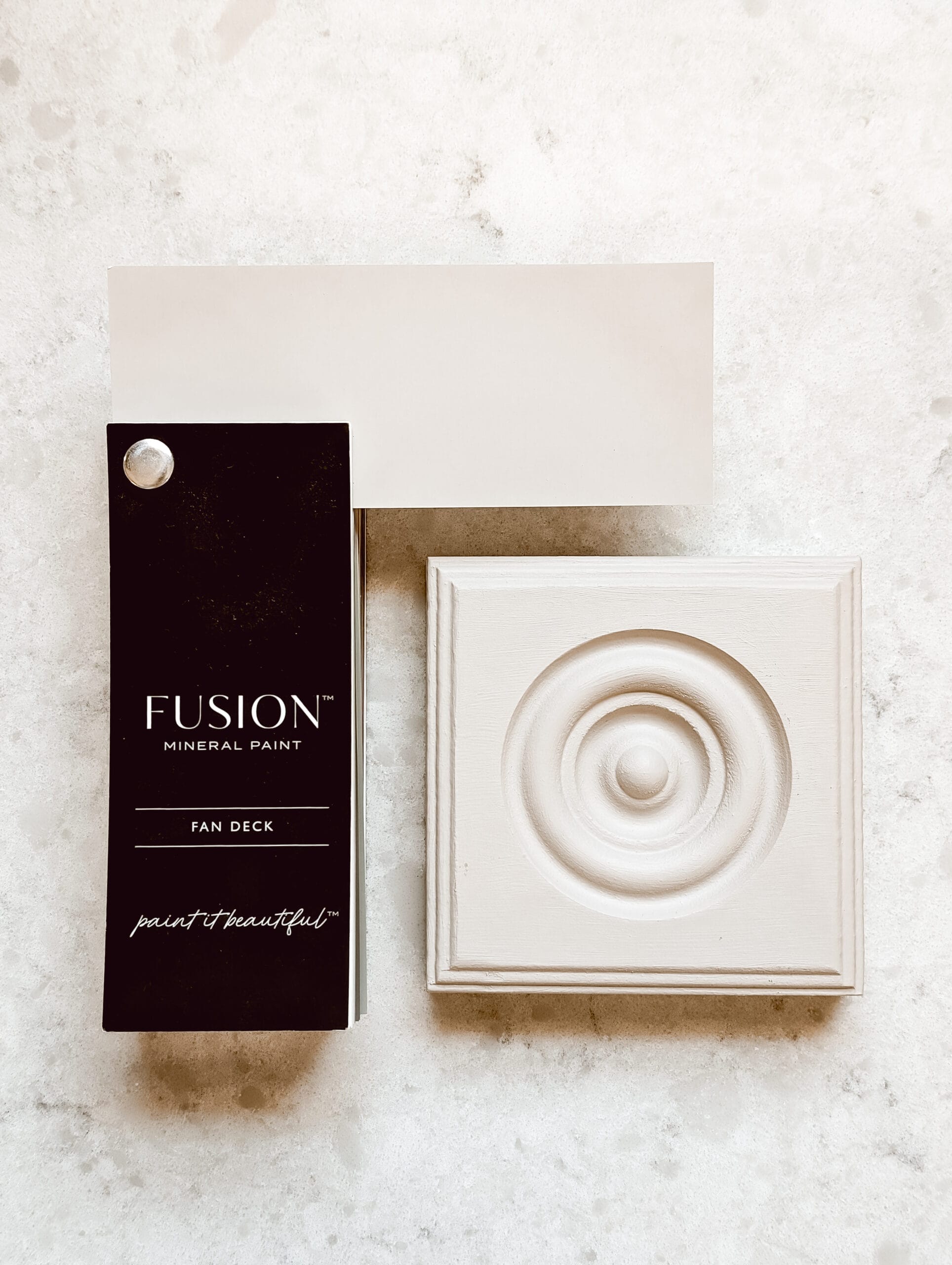
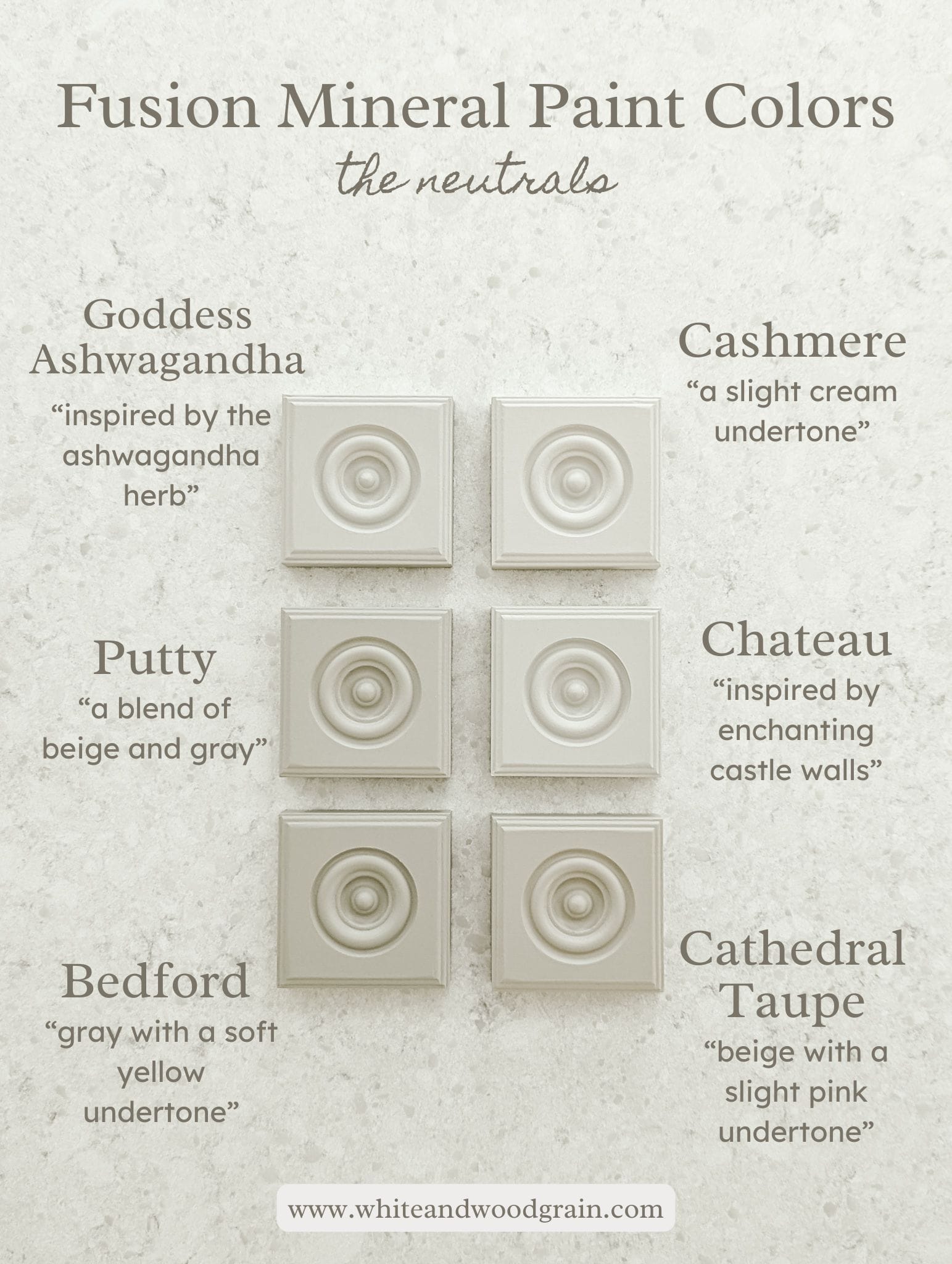
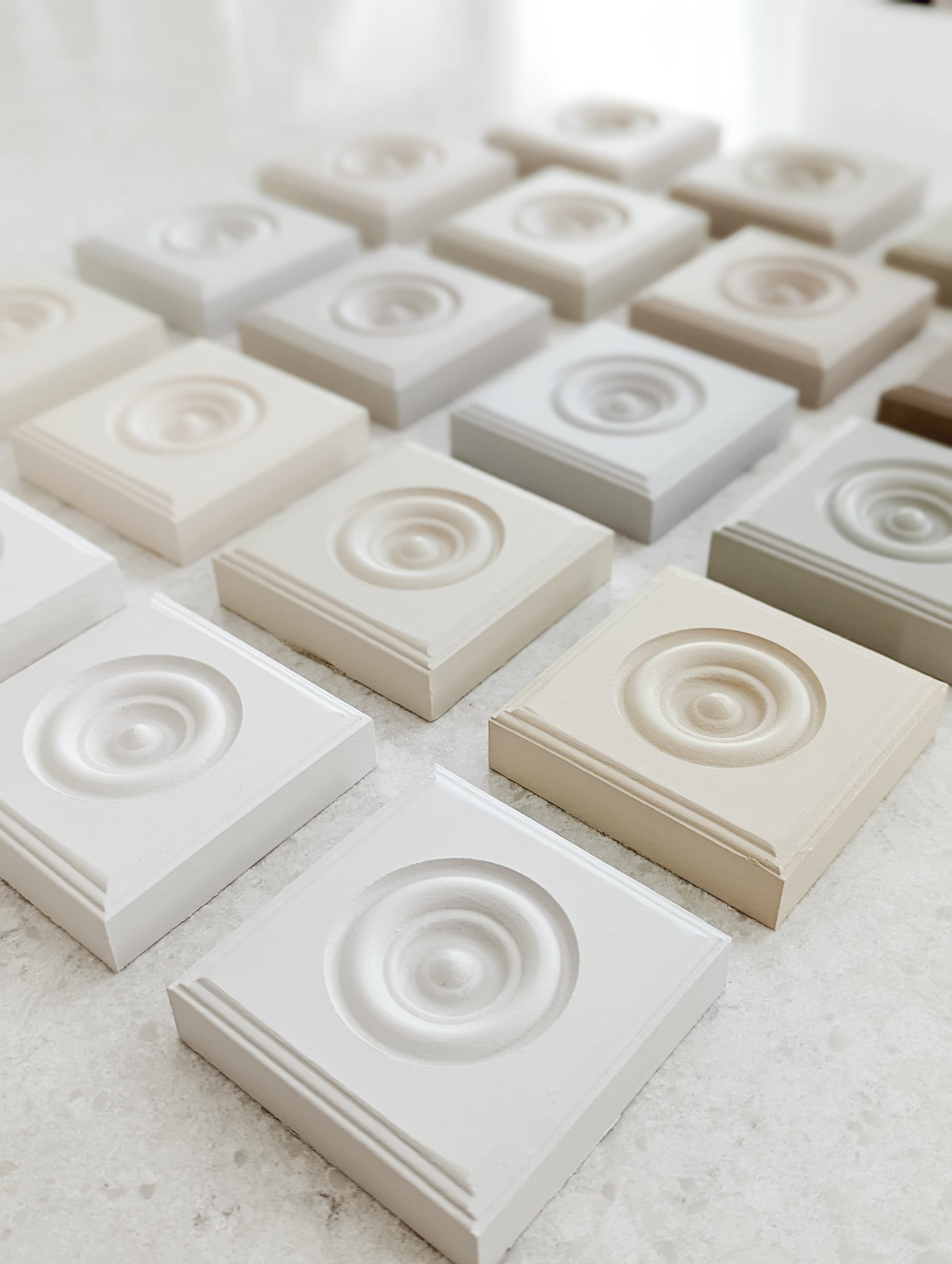
How does Cashmere compare to the other neutrals from Fusion Mineral Paint?
I’m a very visual person. I like to see all the options before I make my final choice! Especially when it comes to paint colors!
Maybe that’s you too? I created a few sample trim pieces below that would help me see the difference between all the neutral paint colors from the Fusion line.
So if you’re like me and you like to see all the options before making your decision, here is a side by side view of 6 different neutrals from Fusion Mineral Paint.
You’ll notice Cashmere in the top of the right corner of the photo below. It is the lightest of the neutrals. For this reason, I find it to look similar-ish to Raw Silk in that it can pass for white. Depending on the colors you pair it with, the lighting, etc.
Tap to Shop Cashmere
The main difference is that Cashmere is more of a cooler toned white whereas Raw Silk is a warmer, creamier white.
I feel like Raw Silk can sometimes look yellow-y. But you don’t get those yellow undertones with Cashmere!
Past DIY’s and Paint Projects using Fusion Mineral Paint’s Cashmere
If you’re struggling to choose the perfect paint color for your next DIY project, you’re not alone!
Sometimes, the easiest way to choose a paint color is to see inspo photos of a particular color in someone else’s home… Photos of a room or a piece of furniture painted in that color.
Let me show you a few past DIY’s and paint projects of mine here at the farmhouse featuring Cashmere by Fusion Mineral Paint.
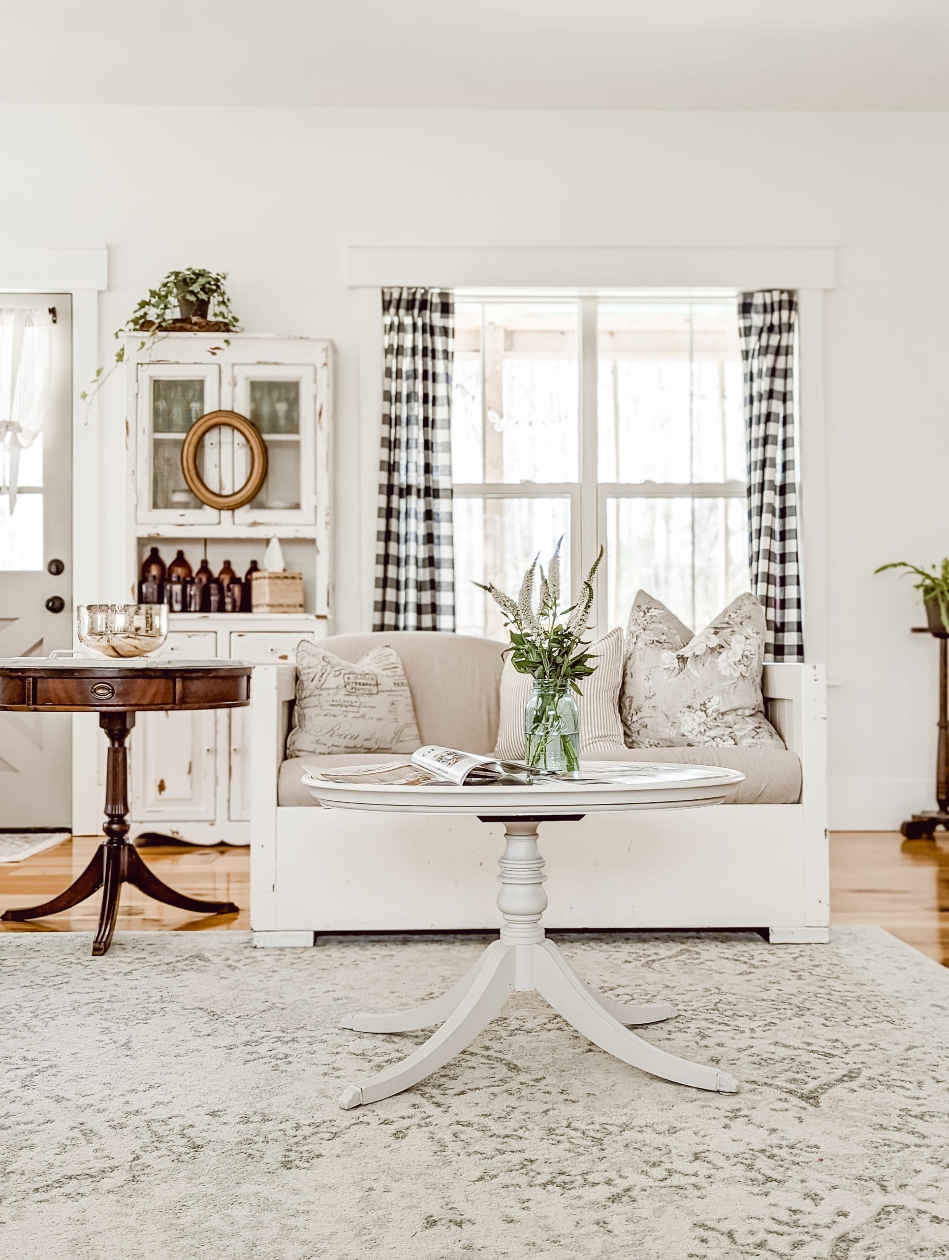
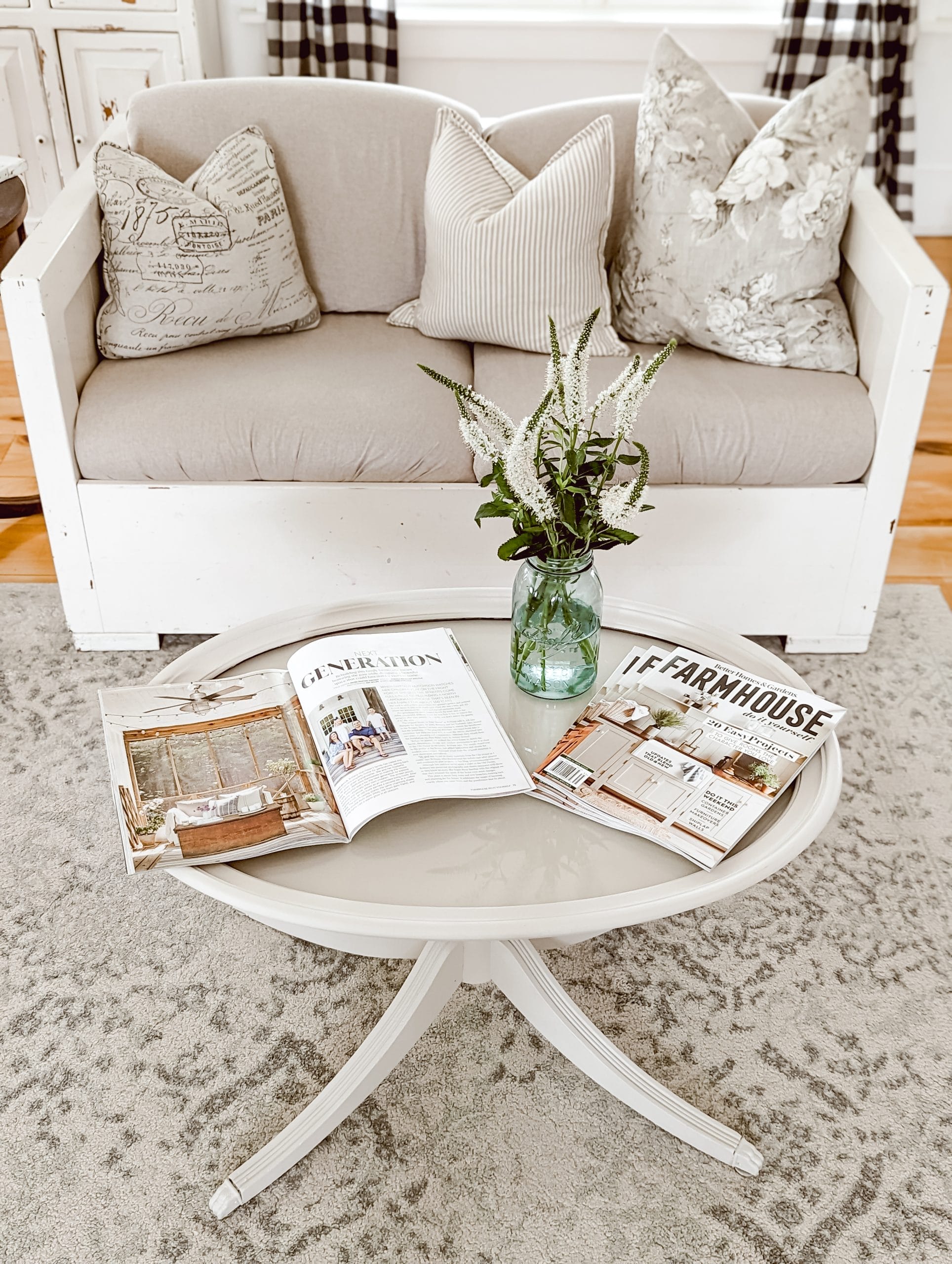
Glass-top Oval Pedestal Table
This little pedestal table is a hand-me-down piece from my mom. I love the turned center, and the legs!
Tap to Shop Cashmere
It has such a pretty shape for a table!
This table used to be a bright blue, so I gave it a mini makeover and painted it to match our neutral cottage style livingroom last year, or maybe the year before.

Tap to Shop Cashmere
I think Cashmere was a perfect fit for this piece! From above, you can see more of the color. It’s very close to white, but that creaminess gives it a little extra depth.
Tap to Shop Cashmere
Vintage Wood Dresser with Painted Drawers
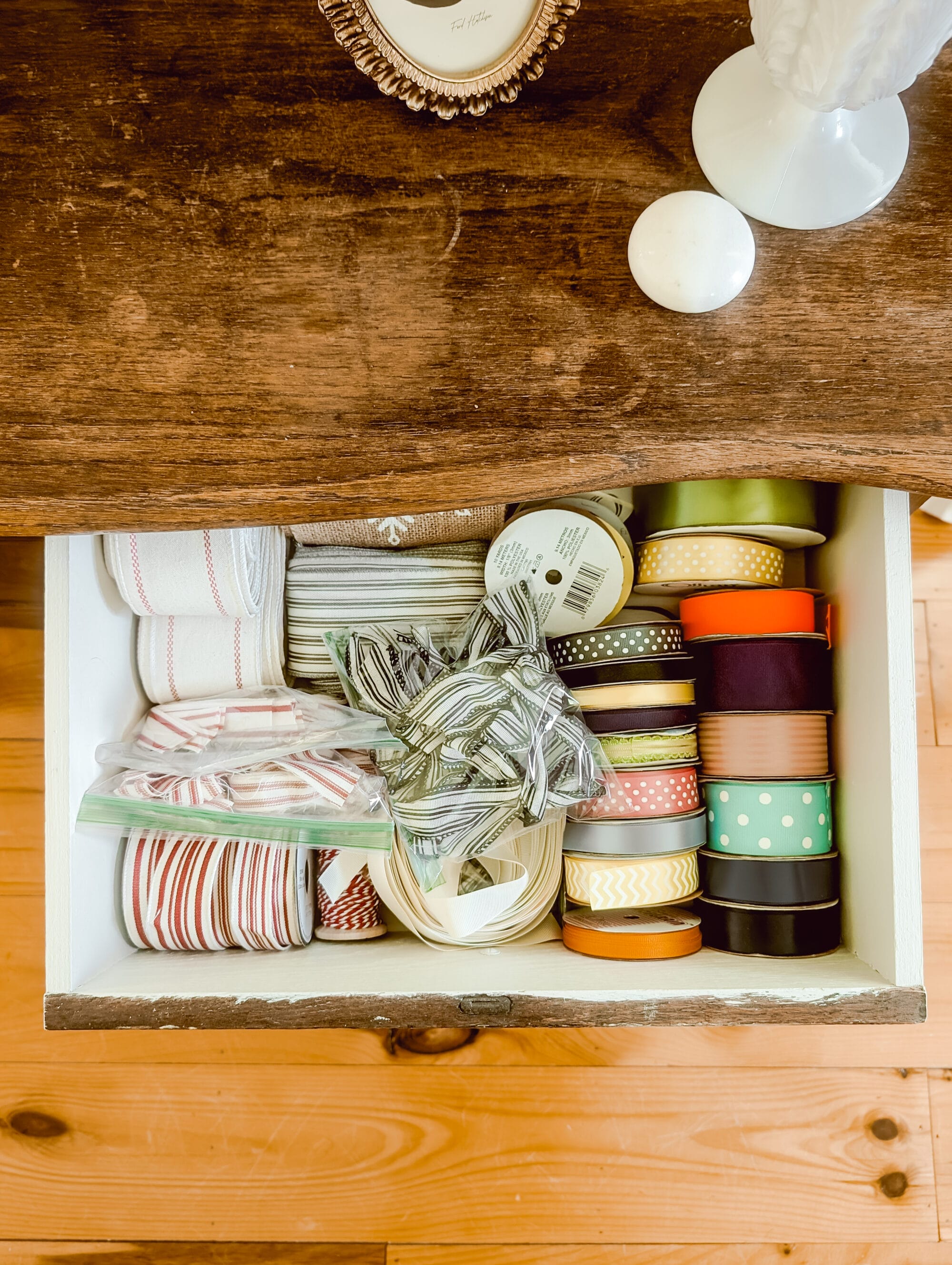
I found this vintage wood dresser at The Shops at Vintage Village in Raleigh, NC. It’s a beautiful 3-drawer wood dresser, and lately we’ve been using it to store wrapping paper, gift bags, tissue paper, etc.
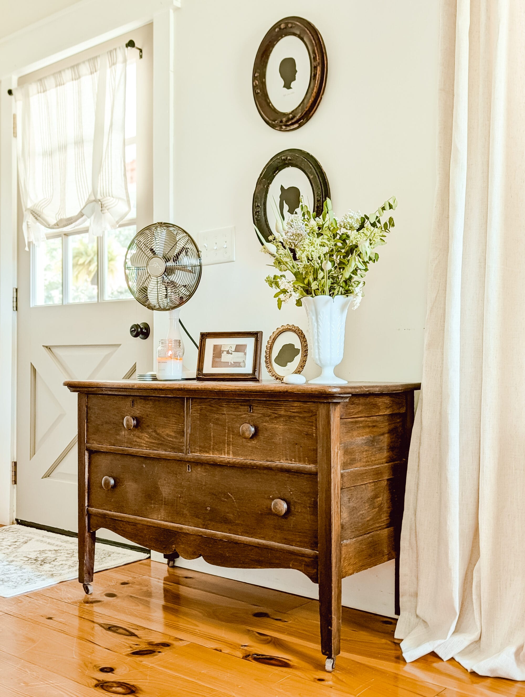
Side note, did you notice those sweet silhouette portraits above the dresser? Those were a recent DIY of mine, and I can’t get over how good they turned out. Click the link above for the full tutorial!
Even though I cleaned it, and wiped it down good, the inside of the drawers still felt dingy.
So I painted them! I painted the insides of the drawers with Fusion’s Cashmere and it made this old piece feel fresh and clean again!

Tap to Shop Cashmere
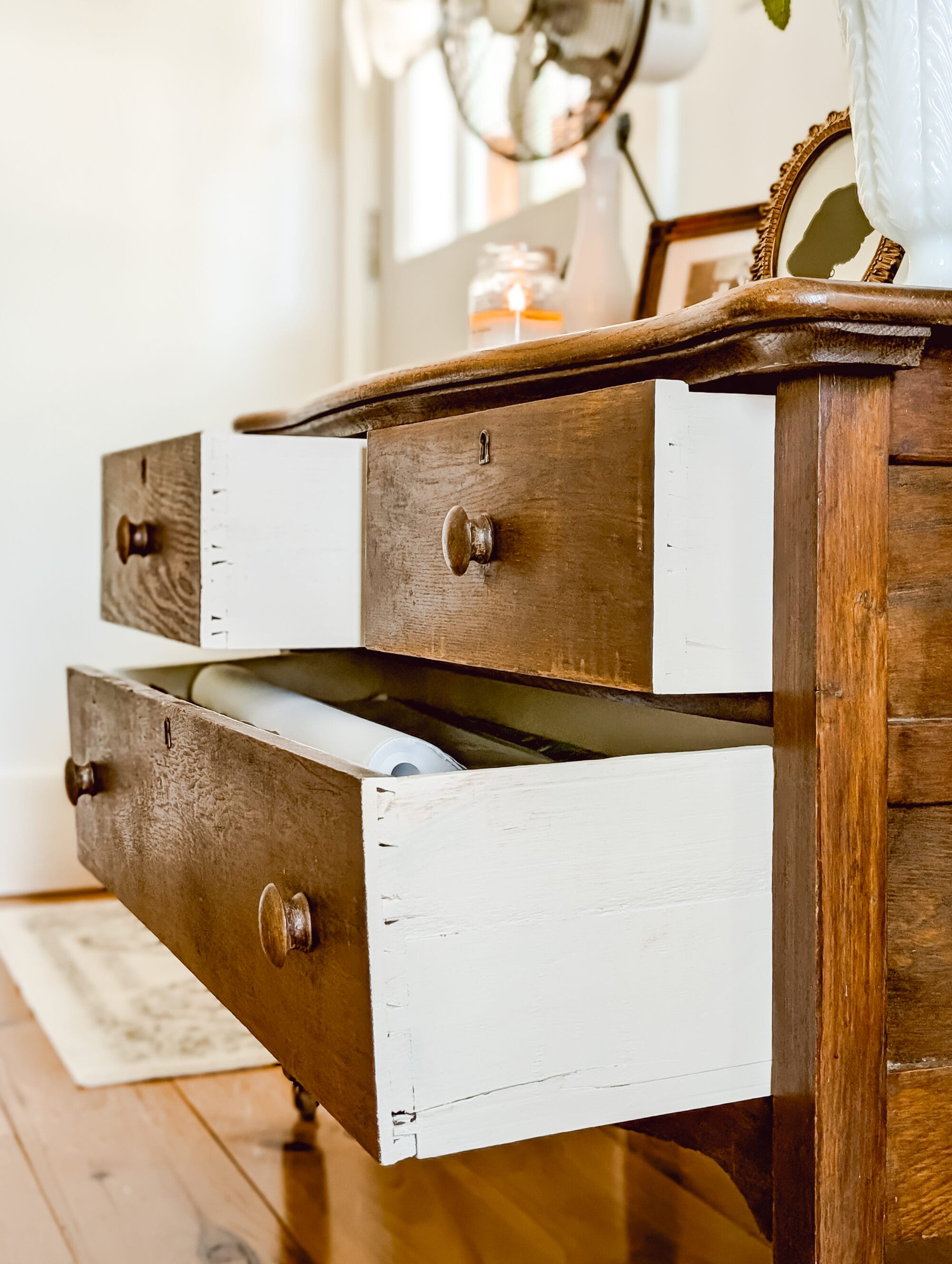
While painting the inside of the drawers, I got the idea to paint the outside of them too.

Tap to Shop Cashmere
And it turned out even better than I imagined! I love the way Cashmere looks next to the dark stained wood on the outside of this old dresser.
Tap to Shop Cashmere
I think next to the wood, Cashmere looks a little more white. Not a stark white, but less tan. And it definitely cleaned up the interior of this piece!

Tap to Shop Cashmere
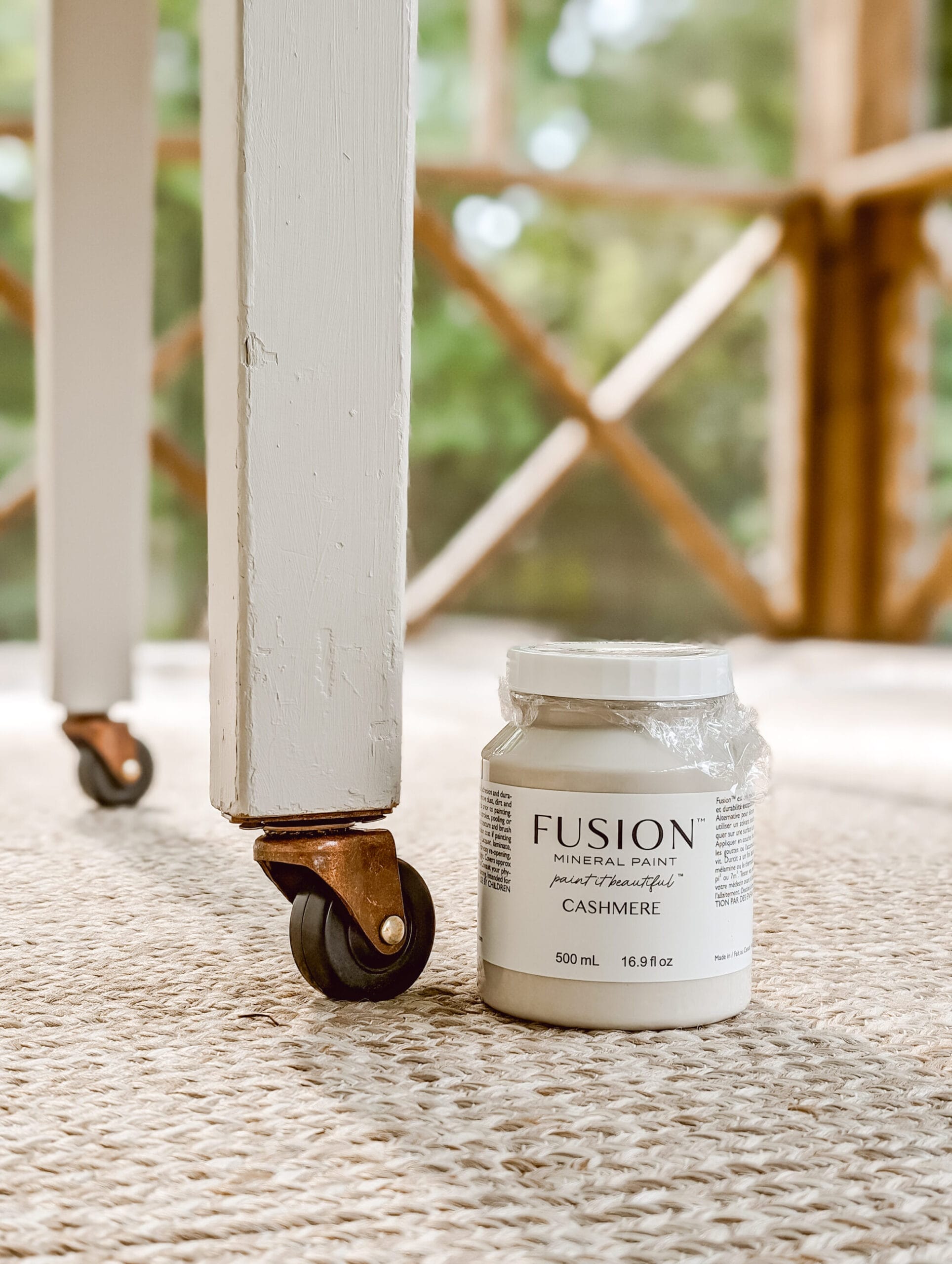
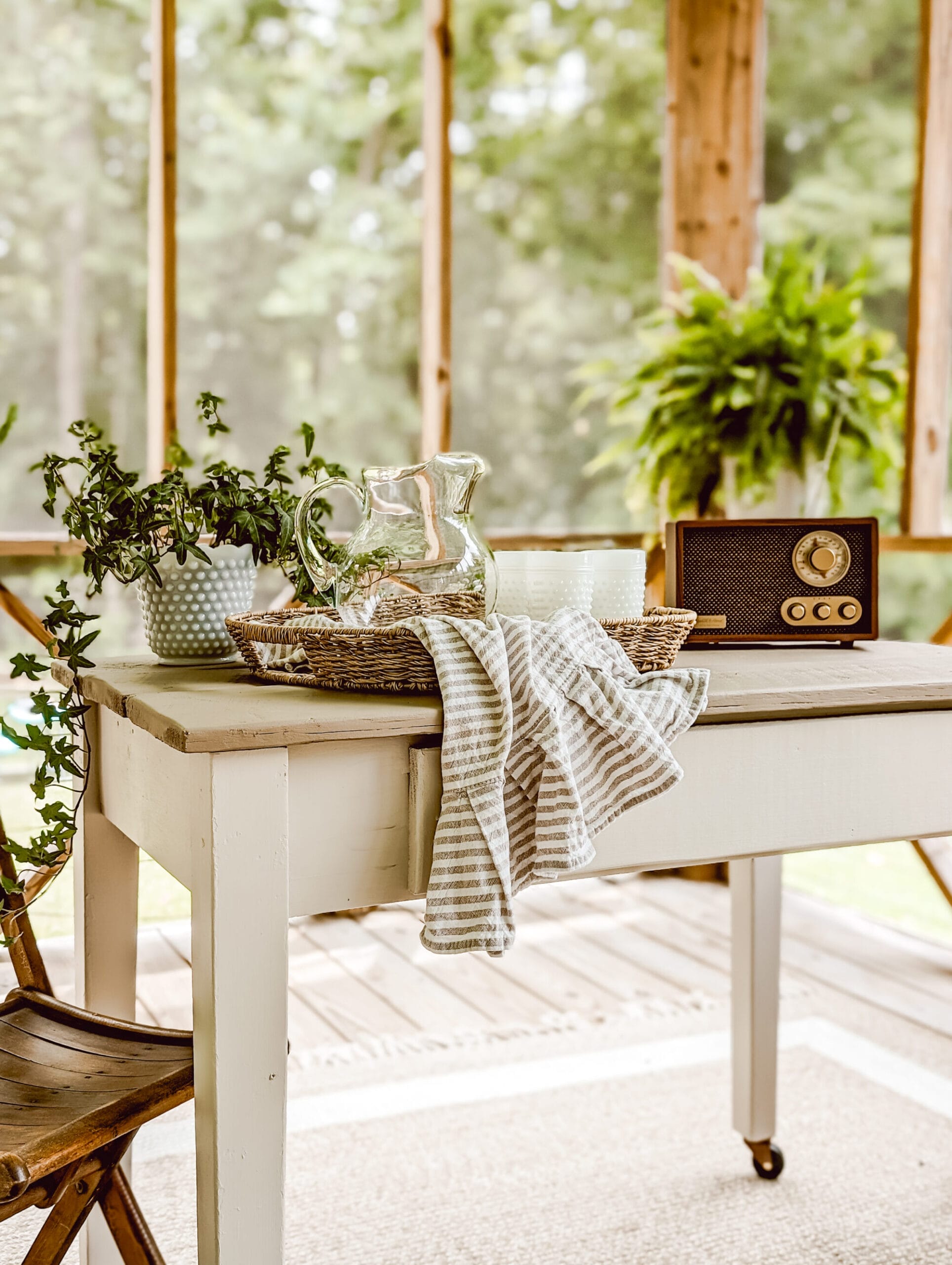
Porch Table Legs
I found this old table at the Liberty Antiques Festival in Staley, NC. It was a little rough when I bought it. But nothing a sander and a fresh coat of paint couldn’t fix.
I also added the little caster wheels so I could roll the table around on the porch as needed!

Tap to Shop Cashmere
The top of the table is painted in Algonquin by Fusion Mineral Paint.
The base and the legs are painted in Cashmere by Fusion Mineral Paint.
The combo of these two colors is just perfection in person! I don’t think the photos do it justice.
Tap to Shop Cashmere
Next to Algonquin, I think Cashmere looks like a true off-white. It’s more cool toned, slightly creamy, very light but not white… and just such a pretty neutral paint color!

Tap to Shop Cashmere

All the White and Neutral Fusion Mineral Colors
If you’re still on the fence about Fusion’s Cashmere, you might want to check out some of the other neutral colors from Fusion Mineral Paint!
There are so many good whites and neutrals from Fusion Mineral! I’d love to share my take on them with you.
If you’re interested, head to this next post where I sampled 18 different white and neutral Fusion Mineral Paint Colors! There’s a ton of info in that post, along with a side by side color comparison for all 18 whites and neutrals. I know you’re bound to find at least a couple new colors to try in your home!
Or if you’re ready to order paint and supplies for your next DIY, be sure to use my code: WHITEANDWOODGRAINFMP to save 10% off your next purchase!
for your next DIY
Save 10% on Fusion Mineral Paints with code:
Thanks for stopping by the blog today! I hope today’s post was helpful, and I look forward to sharing more color reviews featuring my favorite colors from Fusion Mineral Paint.
Click the links below to see more posts in my Color Review Series!
Color Reviews
with Fusion Mineral Paint
-
Fusion Mineral Paint Cashmere: Color Review & Project Inspo
-
Fusion Mineral Paint Picket Fence: Color Review & Project Inspo
-
Fusion Mineral Paint Putty: Color Review & Project Inspo
-
Fusion Mineral Paint Raw Silk: Color Review & Project Inspo
-
Sampling all the Neutral and White Fusion Mineral Paint Colors
It’s my hope this series helps save you some time and money along the way. And I also hope it helps you find a new favorite color or two without having to test them all out for yourself. I’m happy to test them out for both of us! Until next time y’all…
Love, Brittany
Don’t forget to pin this for later!